LaK
Design a modern and trendy aesthetic for this men's footwear brand.
Service
Identity & Branding
Digital & Web
Motion Graphics
Client
LaK
Year
2014-2017
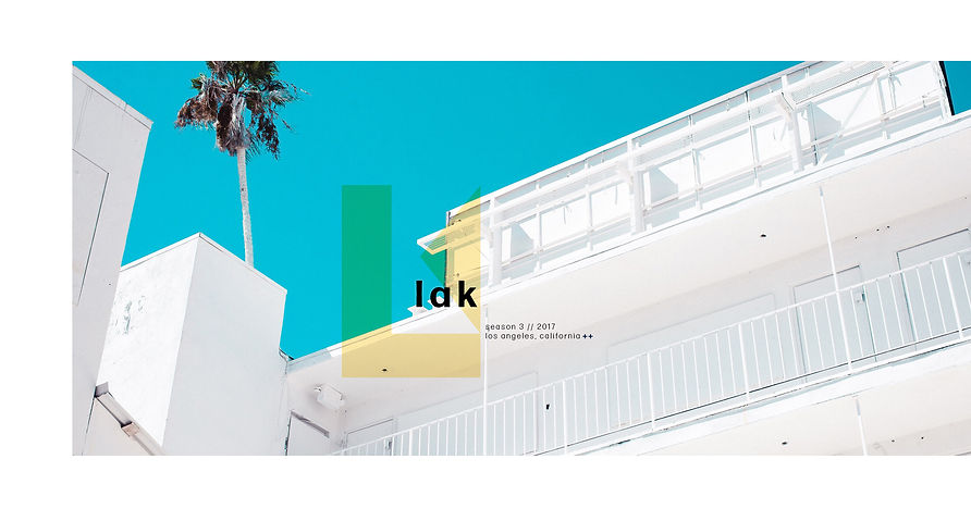
logo
Previously the brand did not use an icon. This icon combines simple geometric shapes to create a capital L, and a capital K within the negative space, paying respects to La and Kristen, for whom the brand is name after.
icon
logotype
The old logotype, shown below, is a serif font with a capital "L" and "K", and a line over the "a" to phonetically pronounce the brand as lake. The new logo is now a bold sans serif font, stylized in all lowercase letters, to give it a modern feel. The line over the "a" has been removed to give the logotype more air to breath.

color
Although the main colors of the brand are black and white, the cream colored sole was the primary focus when designing an aesthetic this collection's assets.
To compliment the cream, a dark blue was chosen for its dark mood. It also provide a solid contrast for the cream and white backgrounds in the photos.
digital assets
These digital assets were created for a lookbook and were also posted to social media and the website. Similar assets were created for emails, advertisements, and promotions, with variations to type.


motion graphics
Motion work to complement the digital assets above. These were used for web and social media.


